5 Insights on Creating Clear, Branded COVID-19 Signage
December 11, 2020 | By Debora Novarini
It’s estimated that, on average, consumers encounter between 6,000 to 10,000 digital or physical advertisements or promotional materials every day. Today, there are substantially more signage and communications added to the mix due to the pandemic, underscoring the ongoing battle for consumer attention.
The current health crisis forced all businesses, offices, and agencies with in-person operations to install signage informing all who enter of their specific health requirements for COVID-19. This influx of directional or instructional signage has never been more widespread or important to all industries – whether employee- or consumer-facing. However, it adds to the ever-growing layer of promotional stimulation – and in some cases, fatigue – many of us experience every day.
As brand designers, we weigh these sweeping, visual sensitivities alongside critically important health messages when working with our clients on their COVID-19 communications. Our process starts by fully understanding the client, their space, their desired user experience and existing communication protocols before any pen is put to paper.
For some clients, we have created basic generic, temporary signage options they can easily print and place in their space. For others, we designed custom installations that become a more permanent fixture in their space and exhibit the brand’s unique style. Based on our recent experience, we developed a set of overarching guidelines to help our clients determine the best approach to creating clear, consistent and user-focused communications.
The topmost concern we hear from client is: “how do we make our people feel safe and prepared for reentry?” Similarly, they worry about the location and visibility of their signage to ensure people see and understand the protocols. Where they differ is how much signage they want in their space.
There is a delicate balance of not wanting to overwhelm clients or customers, while making sure all signage is visible. This largely depends on the type of space and user. For instance, a workplace may need a number of signs in a variety of areas knowing that employees will start to look past the signs over time. In educational settings, such as grade schools or universities, the priority is ensuring students and staff feel supported. They don’t want the signage to come across as forced or harsh, but rather that people are asked to take their safety, and the safety of others, into consideration.
Focus on FamiliarityWhen analyzing the space where the COVID signage will be installed, our design teams are taking into account the surrounding finishes, existing signage and floor layout. The goal is to produce an end product that seamlessly weaves together the company’s brand and required messaging with the overall look and feel of the space.
With each piece of signage, we take the company’s brand and translate that look and feel into a unique language system. By adding a hint of familiarity to their signage, the communications make more sense to the employee, who is likely very aware of the firm’s voice and brand standards.
Address Language BarriersAs a global firm, we work across state and country borders. This means we need to understand the specific governmental or health organization guidelines and also anticipate any language barriers. For example, we often have to factor in differing dialects or translations. We must avoid using phrases that are uncommon in their country or verbiage that does not directly translate. This extends even to the specific naming of objects, such as choosing between “masks” or “face coverings.”
The overall tone and choice of verbiage is also very important. For instance, retail clients are very concerned for the health and safety of their patrons. However, they don’t want their signage to intimidate customers or take away from their shopping experience. In this case we may pair down the amount of signage, but use larger, softer language or expressions to communicate the protocols. Compare to that to a corporate law office that is typically more direct, less frills. Not everyone wants to communicate in the same way, so it is our job to listen and deliver.
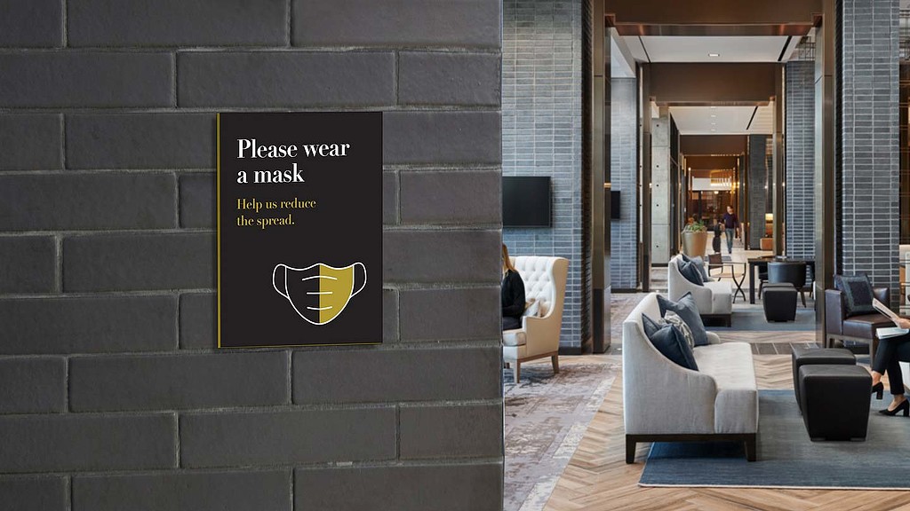
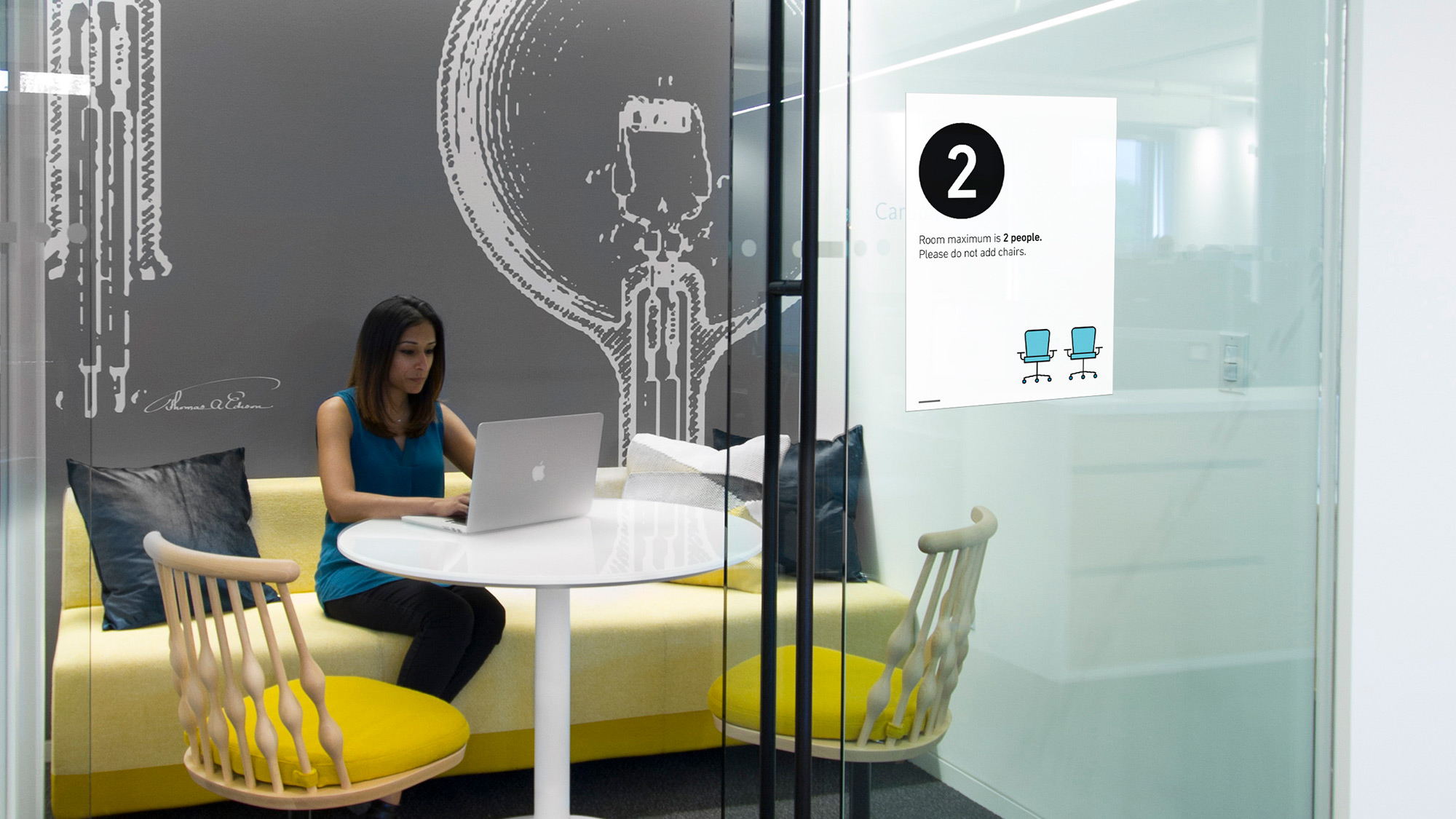
Simplicity is KeyWhile the messaging can differ based on project type, the mission is the same: keeping people safe and aware that their health and safety is the main priority. Ultimately, clear, straightforward language is always best to convey important messages. We are helping our clients take a situation that is complicated and unpredictable and make it as easy as possible for their customers or employees to understand.
Our perspective on signage is that it must be calm, informative, and respectful. We never want people to feel shamed by instructions in their environment. The goal is to encourage and ask people to practice health and safety measures that will benefit themselves and others around them. Simple, clear language paired with clean iconography makes your messaging easy to bridge the gap between client intentions and user actions.
For media inquiries, email .